
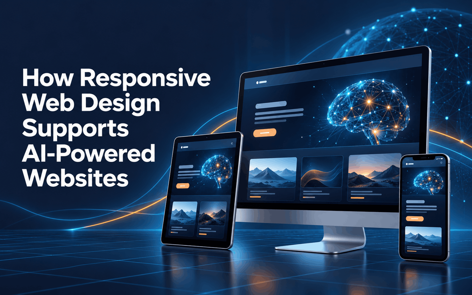
Responsive Design · AI-Powered Websites · Animink
Why Animink’s Responsive Web Design Matters for AI-Powered Websites
Websites have come a long way from serving as simple online brochures. Today, a business website may answer customer questions through an AI chatbot, recommend relevant products or services, personalize content based on visitor behavior, collect leads, schedule appointments, and help guide customers through important purchasing decisions. As these capabilities become more sophisticated, the foundation supporting them matters more than ever.
That foundation begins with responsive web design.
A website can have impressive AI features, but those tools lose much of their value if visitors struggle to use them on a smartphone or tablet. Slow pages, awkward navigation, difficult-to-read text, or a chatbot that covers half the screen can quickly turn a helpful digital experience into a frustrating one.
Animink approaches responsive website development with the entire user experience in mind. By combining mobile-friendly website design with performance, usability, and modern functionality, businesses can create websites that not only look good across devices but are also prepared to support the growing role of artificial intelligence.
Jump To Section
More Than Screen Size
Responsive Design Is About More Than Screen Size
Responsive web design is often described as creating a website that automatically adjusts to different screen sizes. While that is certainly part of it, effective responsive design goes much further.
Visitors may arrive on a website from a desktop computer at work, browse again from a tablet at home, and eventually return from a smartphone when they are ready to contact the business. Each experience needs to feel natural and consistent.
Responsive design considers how menus behave, where calls to action appear, how quickly pages load, whether forms are easy to complete, and how content is prioritized when less screen space is available. Buttons should be easy to tap without accidentally selecting something else, text should be readable without zooming, and images should resize appropriately without slowing down the page.
For businesses looking for responsive web design in Charlotte, Animink focuses on creating websites that adapt to the way real customers browse. That becomes especially important when the website includes AI-driven features that visitors need to access just as easily from a phone as they would from a desktop.
Chat Across Devices
Giving AI Chatbots Room to Work on Every Device
One of the most visible applications of AI on business websites is the chatbot. AI chatbots can answer common questions, help visitors find information, capture leads, recommend services, and provide assistance outside normal business hours.
However, successful AI chatbot integration requires more than adding a chat icon to the corner of a website.
On a large desktop monitor, there may be plenty of space for a chatbot window alongside the website content. On a smartphone, that same interface has much less room to operate. Poor implementation can result in chat windows that obscure navigation, cover important buttons, or make it difficult for users to return to the main website.
Responsive design allows the chatbot experience to be considered as part of the overall interface. Its placement, size, controls, and interaction with other page elements can be optimized for different devices.
The result is an AI tool that feels like a natural extension of the website rather than something that was added afterward.
Relevant Experiences
Supporting More Personalized Website Experiences
AI-powered websites are also making it possible to deliver increasingly personalized experiences. Depending on the technology being used and the information available, websites may adjust recommendations, highlight relevant content, or guide visitors toward resources based on their interests and previous interactions.
Responsive design helps ensure that those personalized experiences remain useful regardless of the device being used.
Imagine that an AI-powered system recommends a specific service, article, or product based on a visitor’s activity. On desktop, the recommendation may appear prominently beside the main content. On mobile, simply shrinking the desktop layout could bury that recommendation far down the page.
Thoughtful responsive design allows important content to be reorganized rather than merely reduced in size. This helps businesses maintain the value of personalization while creating a cleaner experience for mobile users.
For AI-powered websites, that flexibility will become increasingly important as websites become more dynamic and responsive to individual customer needs.
Built to Perform
Performance Matters When AI Is Part of the Experience
Every additional website feature has the potential to affect performance. Images, video, tracking tools, third-party applications, personalization systems, and AI functionality can all add complexity behind the scenes.
That makes website speed an important consideration from the beginning.
Visitors expect websites to respond quickly, especially when browsing from mobile devices. A feature may be impressive, but it will not provide much value if customers become frustrated waiting for the page to load.
Good responsive development can help manage this complexity by considering how website assets and features behave across different devices. Images can be optimized appropriately, unnecessary elements can be minimized, and the overall structure of the site can be developed with performance in mind.
This balance is particularly important for businesses adopting AI. The goal should not be to pack as many advanced features as possible into a website. Instead, technology should enhance the customer experience without making the site cumbersome or difficult to use.
Consistent Experience
Creating a Consistent Customer Journey
Customers rarely think about whether a website is technically responsive. They simply know whether it works.
A visitor who can easily research a service on a laptop should be able to continue that journey from a smartphone without feeling like they have entered a completely different website. Branding should remain familiar, navigation should make sense, and important functionality should remain accessible.
That consistency also applies to AI-powered interactions.
If a chatbot is easy to access on desktop but difficult to use on mobile, the customer experience becomes fragmented. If personalized recommendations look polished on a tablet but disappear into a cluttered mobile layout, their effectiveness may decline.
A strong mobile-friendly website design creates continuity between these experiences. It allows businesses to offer advanced functionality without sacrificing usability simply because a customer changes devices.
Clear Conversion Paths
Responsive Design Can Help Turn Visitors Into Leads
Ultimately, business websites are expected to accomplish something. That may mean generating a phone call, collecting an inquiry, scheduling a consultation, selling a product, requesting a quote, or encouraging another meaningful action.
Responsive design helps remove obstacles between visitors and those actions.
Forms should be simple to complete on mobile devices. Phone numbers should be easy to tap. Calls to action should remain visible without overwhelming the page. Navigation should help visitors quickly find what they need rather than forcing them through complicated menus.
AI can strengthen this process by answering questions and guiding visitors toward the next step. When responsive design and AI work together, businesses can create a smoother path from initial interest to conversion.
For example, a mobile visitor researching a service may have a question before submitting a contact form. An accessible AI chatbot could provide an immediate answer and direct that visitor toward the appropriate page or action. Responsive design ensures the entire interaction remains comfortable on the smaller screen.
Ready for What Comes Next
Building Websites That Are Ready for What Comes Next
The rapid growth of artificial intelligence makes flexibility especially important in website development. The AI capabilities businesses use today will continue to evolve, and entirely new applications are likely to emerge.
Businesses need websites that can support innovation rather than becoming outdated every time a new technology appears.
Animink’s approach to responsive web design in Charlotte provides businesses with a strong digital foundation. Responsive development supports current customer expectations while making it easier to incorporate features such as chatbots, personalization, automation, and other AI-driven experiences.
Just as importantly, the technology should continue to serve the customer rather than distract from the reason the website exists.
AI can make websites smarter, but good design makes those capabilities useful.
Quick Answers
Frequently Asked Questions
Responsive web design is an approach to website development that allows pages, images, navigation, and other elements to adjust to different screen sizes and devices. The goal is to provide a consistent, easy-to-use experience on desktops, laptops, tablets, and smartphones.
AI-powered websites may include chatbots, personalized recommendations, dynamic content, and other interactive features. Responsive design helps ensure these tools remain accessible and functional across different devices rather than interfering with navigation or other important website content.
Yes. Proper AI chatbot integration can provide a smooth experience for both desktop and mobile users. The chatbot interface should be designed to fit smaller screens, provide easy-to-use controls, and avoid blocking important navigation or calls to action.
Responsive design can support conversions by making it easier for visitors to navigate the website, complete forms, contact the business, and interact with important features. Removing usability barriers can create a smoother path from browsing to taking action.
Animink provides responsive web design services focused on creating websites that are visually appealing, functional, mobile-friendly, and prepared to support modern digital capabilities. By considering usability, performance, customer journeys, and features such as AI integrations, Animink can help businesses build websites designed for both today’s users and tomorrow’s technology.
Built for Smarter Experiences
Build a Smarter, More Responsive Website With Animink
As businesses explore AI-powered websites, it can be tempting to focus primarily on the newest features. Chatbots, personalized experiences, automation, and intelligent recommendations can certainly make a website more capable, but they work best when supported by thoughtful design.
Responsive web design helps create that foundation.
Animink combines responsive development with a focus on usability, performance, functionality, and the customer journey. The result is a website designed to work across devices while providing the flexibility businesses need to incorporate new digital capabilities.
Whether a visitor arrives from a desktop computer, tablet, or smartphone, the goal remains the same: make it easy to find information, interact with the business, and take the next step.
As AI becomes an increasingly important part of the online experience, businesses that pair intelligent technology with responsive, user-focused design will be better prepared to meet changing customer expectations.