Responsive & Mobile Web Design
Schedule a free consultation
We deliver software that solves problems. Take the first step.
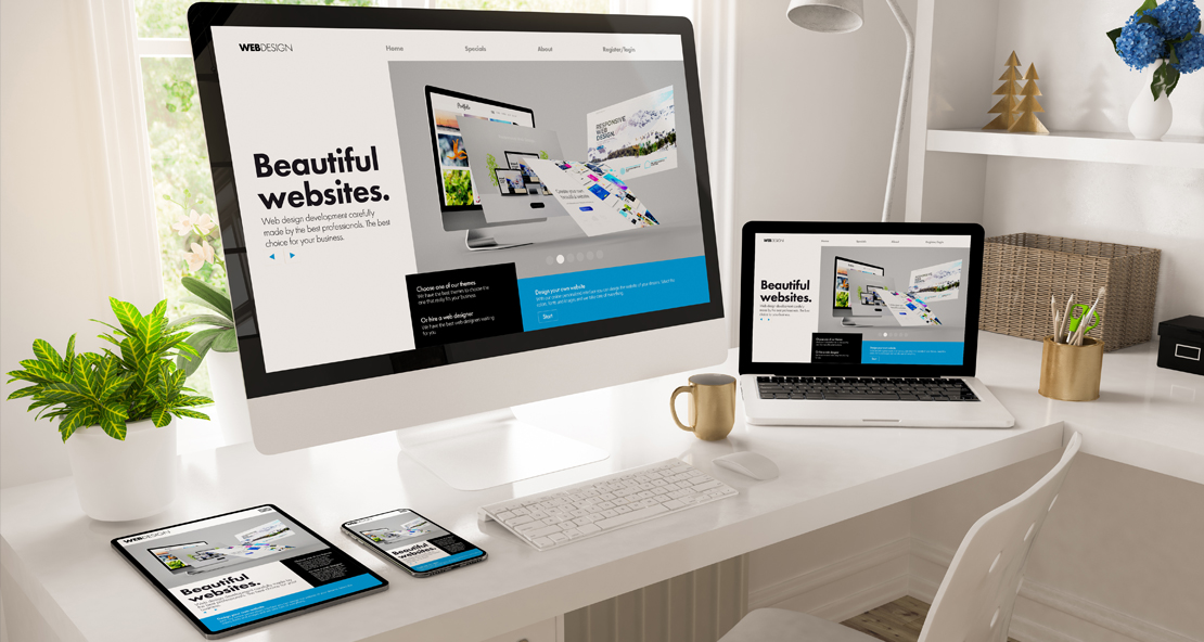
Responsive Website Design Services
A Responsive Web Design Company – the Mobile Takeover
The way that users access the web is undergoing a radical shift. What once was only viewed via desktop computers has now been made available by mobile devices ranging from tablets to smartphones, just about anywhere. Over 50% of website traffic comes from these mobile devices, and that number is only expected to grow. People have always been on the go; going mobile for online access simply makes life easier. Thus the need for a responsive web design company.
How does that affect your business? If you have a website, and it’s not designed to accommodate mobile traffic, you’re missing out on a massive amount of visitors. If they are unable to view your site because the navigation isn’t designed for touchscreens, or the content is simply difficult to read, they will bounce to another website, leaving a potential sale in the dust. This is where responsive web design services come into play, ensuring your site is accessible and user-friendly on all devices, capturing and retaining more visitors.
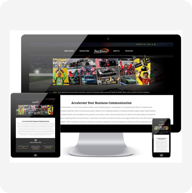
Responsive Website Design in Charlotte – One Website for Multiple Devices
So how can a site be developed to accommodate all of these different types of devices, range of resolutions, and even orientations (holding a device vertical or horizontal)? Your site needs to be designed responsively. Animink specializes in responsive web design that not only solve this problem, but convert visitors into customers. The experience for users on different device types may be slightly different, however there will be a consistency within your website that will travel across all device types, further establishing your brand as a professional company in the online space.
A Responsive Web Design Company – Take the Test
Curious if your site is mobile-friendly? Take Google’s test and find out
Typically what you’ll see are a few failures within the test. These include, but aren’t limited to: Text too small to read: Let us explain something called ‘bounce rate’. This is the percentage of visitors that leave your site after viewing only a single page. If your site visitors can’t read the text on their mobile device because it’s too small, they will bounce. Leverage responsive website design in charlotte to solve this problem. It’s important that legible font sizes are used, and this sizing differs between devices. Links too close together: Your current website may look great for visitors on laptops. Unfortunately, over half of internet traffic is now on mobile devices, demanding a responsive web design. They’re using their fingers to surf the web, and need proper spacing to adequately navigate your website. Mobile viewport not set: Again, your site may look great on a large computer, but visitors on mobile phones may only see half of your website, forcing them to slide your site from side to side to see all of the content. Sound like a minor issue? Multiply the above minor issues by thousands of potential visits, and your business suffers from an epidemic of lost sales.
Responsive Website Design in Charlotte – Analysis & Testing
Guess what else is a huge factor in Responsive web design… Speed! If your visitors are on a mobile device using a data connection and not wi-fi, your site should accommodate this by showing highly optimized images and content. Otherwise, you risk losing the visitor as they wait for your images or media to load. Don’t lose valuable traffic. Work with Animink, a responsive web design company.
At Animink we provide responsive website design in Charlotte, Raleigh, and across the entire country.
Give us a call, we can help with your responsive web design project.