
You may have heard the term ‘Responsive Web Design’ tossed around lately. The term refers to a website that dynamically adjusts to the browser width of the device in use. The site code ‘responds’ to the width, thus the name.
As website developers, it is our job at Animink to create a site that is optimally displayed on all devices, from PC’s to tablets to phones. With so many devices and screen resolutions available, responsive sites allow the flexibility to adjust on-the-fly.
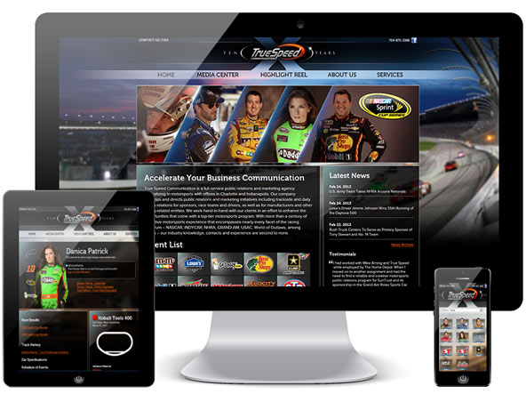
Animink creates exceptional responsive website designs. The versatility of a responsive site allows your product or service to be showcased quickly, and functionally on all devices.
As a Charlotte Web Design studio, we’re proud of the work we have produced in the NASCAR industry, however, we love a challenge in any industry. Contact us today for your next project.


